The Proportion Principle
Photo from Pexels
I’m often asked where most design mistakes are made. Many come to mind, like latching on to quickly outdated trends, forcing furnishings or a design style that is incongruous to a home’s architecture, or doing DIY when a skilled professional is required. But one of the biggest mistakes a trained design eye will catch right away is the wrong proportion.
I will often use proportion and scale interchangeably in this post, but there are subtle distinctions between the two. Scale tends to refer to how an item relates to the size of a room or to another object, while proportion tends to refer to the shape of an item as it relates to another.
Both terms in interior design refer in part to the balance between design elements in a space and take into consideration other conditions like shape, color, size and texture. Striking the right balance between design elements in a space is the purpose of correct proportion in interior design.
When proportions are aligned the objects in a space feel copacetic and connected, and that unity allows easy flow through a room. The furnishings have a common or complementary thread and they seem happily communing together. But when something is out of proportion it jumps out and can upset the whole composition of a given space.
One of the most common examples I see are furnishings that are out of proportion to the space they occupy. I’ve seen 18” diameter chandeliers in cavernous dining rooms and oversized upholstery squeezed into a room like 10 pounds of potatoes in a 5 pound sack. It’s always upsetting when a client calls because “something doesn’t feel right” and I have to give them the bad news that the furnishings they’ve spent an arm and a leg on are too big or too small and were an expensive mistake.
I have always believed that a really good designer has “the eye”, that built-in ability to quickly scan a space and sense when something is out of proportion. I believe it is a natural trait that can’t be learned because it’s just felt. However, once I show a client why something isn’t the right size, they too, quickly see where the problem lies. Often, it’s something they’ve fallen in love with online or seen in a 60,000 sq. ft. furniture showroom and not considered the real dimensions of the space it will inhabit.
One of the best ways to avoid these potentially expensive mistakes and missteps is to make a template of the item and put it where you’d like it to live. A simple brown craft paper template representing a sofa’s dimensions or the diameter of a light fixture can save a lot of headaches and wasted cash. I’ve seen way too many ill-proportioned furnishings just absolutely ruin a space. And what started as an excited and anticipated purchase quickly turns into a mistake that is begrudgingly given away – or worse – regretfully and frustratingly just lived with.
Furnishings aren’t the only proportion faux pas. Architectural details, like ill-proportioned fireplaces, under or over-scaled moldings or standard-height doors in a space with 12’ ceilings can make a home visually, and even functionally, awkward. These mistakes of scale are sometimes the difference between a home that ages gracefully and stands the test of time and one that becomes the ugly duckling of the block.
Photo from Pexels
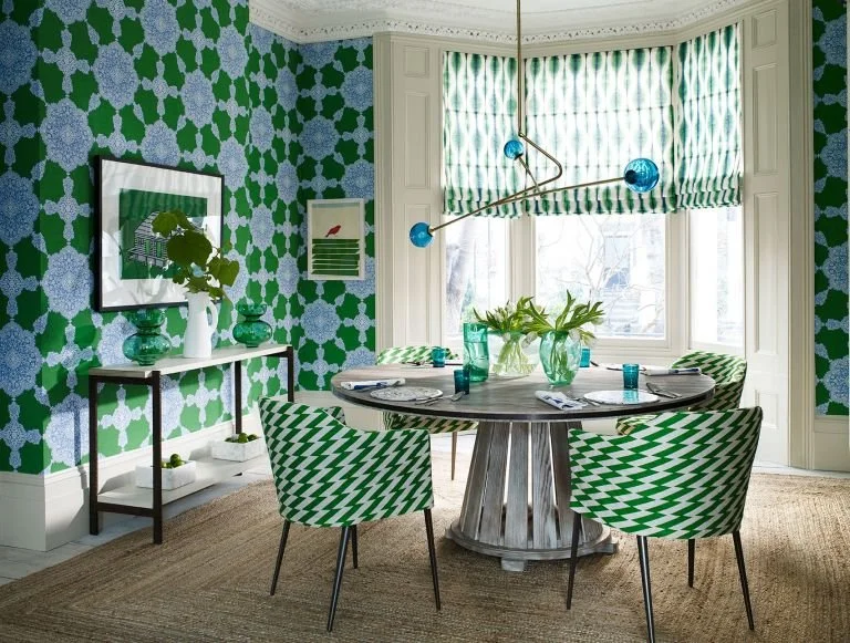
There is a reason that proportion is so important because it is the formula that has proven to work. Even if it’s not always easy to articulate it is easy to spot when it’s off. Some rules of thumb are obvious, like a room with tall ceilings can take more items of height, whereas a room with lower ceilings will lend itself better to lower lined furnishings. While there are tried and true established principles of proportion and scale, there are times when breaking those rules can be provocative and the disparity between objects creates great visual interest. For instance, I always love an overly large-scaled wallpaper in a small powder room. But those occasions are rare and not something I’d suggest a design novice explore on their own (lest they be a glutton for punishment and more costly mistakes).
Observing spaces that feel good, are aesthetically pleasing, and have a nice rhythm can be a helpful first step in understanding the relationship between objects and the importance of proportion and scale. The more we understand this subtle dance of elements, the less likely we are to make mistakes that are out of proportion to the amount of financial loss and mental anguish we may likely experience.


